is what I’ve been saying a lot. It’s when I tell folks that I recently left my salaried/benefited position as a senior graphic designer in lieu of the unpredictable, potentially poverty-making world of freelance. It’s when I need to explain that I wasn’t forced to do this due to a layoff; it’s just that I’m hungry for a different design story.
It might also be because I realized I’d already traversed a few of the 12 steps in Milton Glaser’s The Road to Hell (I’m not sayin’ which ones. But definitely not No. 12. Or No. 11.)
1. Designing a package to look bigger on the shelf.
2. Designing an ad for a slow, boring film to make it seem like a lighthearted comedy.
3. Designing a crest for a new vineyard to suggest that it has been in business for a long time.
4. Designing a jacket for a book whose sexual content you find personally repellent.
5. Designing a medal using steel from the World Trade Center to be sold as a profit-making souvenir of September 11.
6. Designing an advertising campaign for a company with a history of known discrimination in minority hiring.
7. Designing a package aimed at children for a cereal whose contents you know are low in nutritional value and high in sugar.
8. Designing a line of T-shirts for a manufacturer that employs child labor.
9. Designing a promotion for a diet product that you know doesn’t work.
10. Designing an ad for a political candidate whose policies you believe would be harmful to the general public.
11. Designing a brochure for an SUV that flips over frequently in emergency conditions and is known to have killed 150 people.
12. Designing an ad for a product whose frequent use could result in the user’s death.
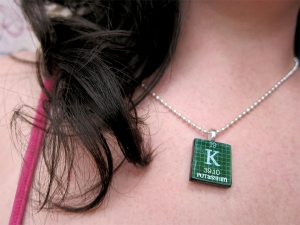
So yes, even in this economy, armed with a lap top and incredibly encouraging circle of friends and colleagues, I left my comfortable 9-5 gig to start Potassium Design.
*Potassium symbol necklace (which is double cool because it’s on the back of a scrabble tile) was given to me by the always thoughtful Stacy Dutton.

