 Friend, client and inspiring textile designer, Michelle Fifis was featured on Design Sponge today! But it wasn’t her gorgeous designs that were discussed but rather her expert marketing tips that she self-taught to get her work noticed. And now she’s sharing them with us!
Grandchildren of ‘Sound of Music’ von Trapps Form Band
The release date for a current project received a mention Rolling Stone! Maybe you’ve heard of this family!

Stay tuned for a peek of the gorgeous and unique packaging, or better yet, preorder the album here.
Capitalize on that!
The rules for capitalizing a title seem to evade most folks. In grade school, many of us learned to capitalize “the first word, the last word and every important word in between.” Instead of debating what constitutes an important word, most businesses use Chicago Style, which can be a bit difficult to memorize if headline writing isn’t part of your everyday practice.
That’s why TitleCapitalization.com is so brilliant and bookmark-worthy! Best find of the year so far.
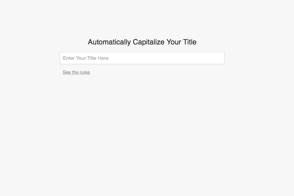
Wishing you a warm and happy holiday
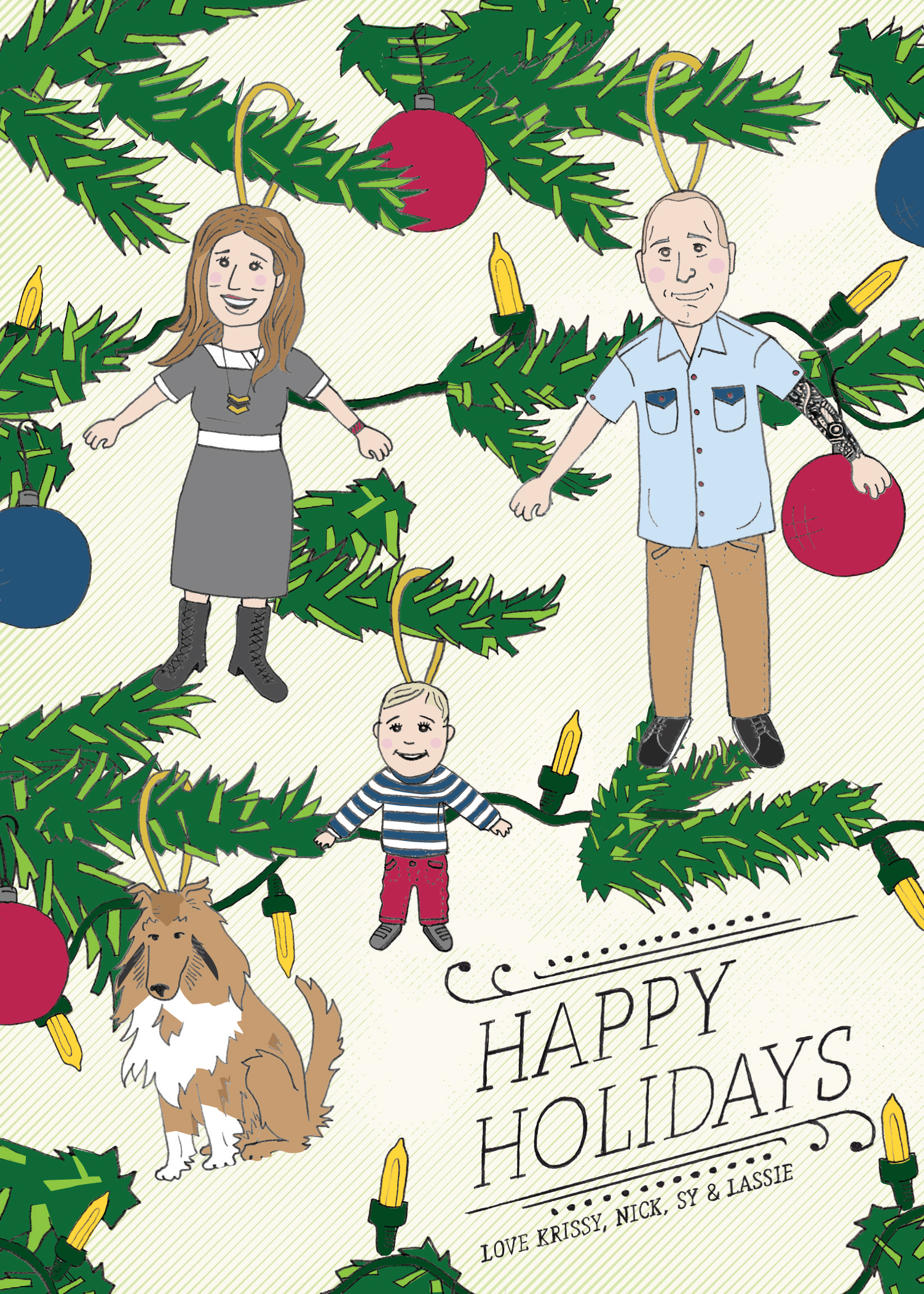
New Work: A great camp needs a great website
A couple of years ago I was asked to create a logo and identity for Camp Blue Spruce, a summer camp for kids with food allergies. Now after two successful summers, the camp is growing up and discovered a different set of needs for their website, so we created them a new one! Using the wordpress platform, we set up a site that would be easy for them to update with new content and yearly photos. This website has become the main tool to convey all of the information to parents, let them register their kids online and even keep track of activities while camp is in progress. See it live.
Trend Watch: Flat Design
It may be time to reconsider your logo’s drop shadow.
The new iOS 7 for iPhone has many commenting on the new and very flat look of the interface. With fewer highlights, shadows and reflections being used the icons no longer have dimension. Apple isn’t the only one to integrate this flat design though. Google recently tweaked their logo and ditched their drop shadows and highlights in favor of a very 2D look. And it’s actually Microsoft that has been leading this trend with their release of Windows 8 which values clean content over graphics that que the type of information.
Windows 8 Home Screen:

The trend toward flatness seems to be a backlash to the previously used skeuomorphic design. Simply put, skeuomorphism in the digital world is when an icon or graphic is made to look like its real-life equivalent. And it is probably what has given Apple products the reputation for being more intuitive and easy to learn. iPhone’s game center had a green felt poker table look; the newsstand was a pine book case; when you recorded a message, you spoke into a 3D looking microphone. Apple’s software chief Craig Federighi, quipped “we just completely ran out of green felt and wood – this has got to be good for the environment.”
iPhone OS 6 & 7

Most designers we know would say that this more minimalist approach has long been a trend in design for the non-digital realm, and a request for a drop shadow or highlight may often provoke a cringe. But knowing that Apple’s design has historically influenced the masses, we are very eager to see how far this trend will go.
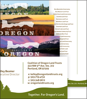
New Work: Coalition of Oregon Land Trusts
Potassium Design was recently asked to help create a new identity for the Coalition of Oregon Land Trusts. The challenge was to create a logo that captures the essence of the many diverse landscapes in the state, so that each land trust was represented.
![]()
When fleshing out the rest of the brand identity, it was obvious that our greatest resource was all of the amazing imagery captured by the land trusts of their beautiful views. The only problem was deciding which of the amazing images to use! We chose instead to not limit ourselves and use several images for the backs of the business cards. All put together the identity creates a beautiful collage of Oregon scenery.
Fine, but can he even use a mouse?
In the beginning of June, we celebrated the launch of our biggest, and most rewarding project to date: Silas Glen. Working titles: Sy, Sy Guy, Sly, and Fresh Prince.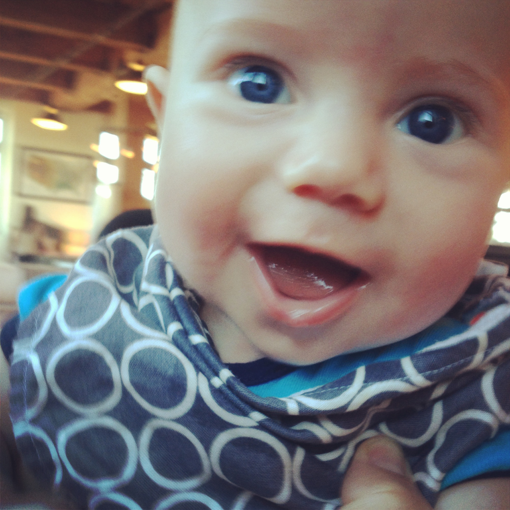
A Brief Haitus
New Work: Benmar Farm
As our first international project, the sweet ladies of Benmar Farm from Australia contacted us to create a logo for their dairy farm to be used on packaging for the milk they would sell. They requested a hand drawn logo to reflect their small, not mass-produced business. They also wanted a cow to be central to the logo to reflect their gentle care and raising of the animals.![]()